“The spaces we live in are a projection of ourselves, of our being and of our style. Walls become design elements where attention to health and well-being goes hand in hand with a strong aesthetic taste for decoration.”
Colour in the world of interior design is paramount to creating comfortable and stimulating spaces. A wise and well-balanced choice of colours is invaluable in determining the perception of space.
To help decoration professionals implement interior design projects in line with the most current market trends, CAP Arreghini has developed a combination of trendy colours that reflect the unique and exclusive Italian style, thanks also to a close collaboration with Architects and Designers.

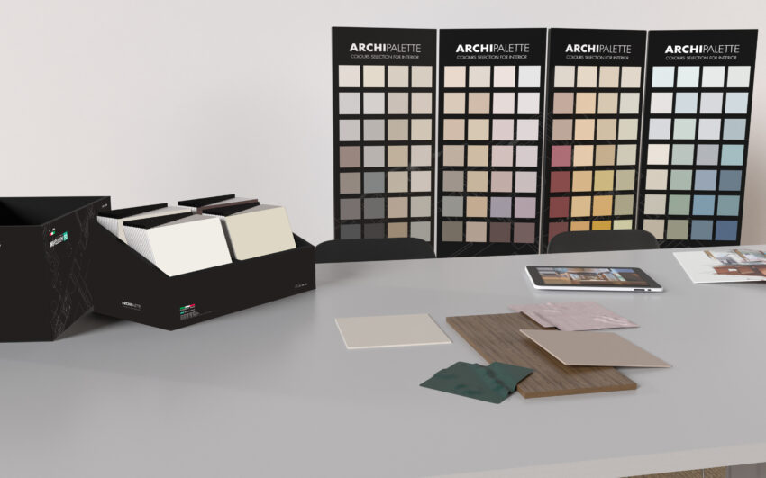
The ARCHIPALETTE display is a dedicated tool for the CAP Arreghini points of sale. The display shows the same range of colours that can be found in the Archipalette folder, helping the interior designer or the client choose the right combination of colours for the ideal decorative solution, thanks to the countless colour combinations that are possible.
The display faithfully reproduces the 112 colours from the Archipalette folder, starting from the lighter shades and gradually getting darker, to express the ideal and most contemporary decorative solution to be created according to the size and level of brightness in the room.
Particular nuances and countless colour combinations can be recreated at the CAP Arreghini point of sale, which can be reproduced with specific interior paints and enamels for any space and requirement, according to the project to be developed.
In addition, thanks to the colour cards, the chosen colour plan can be tested directly in the intended space, considering the level of brightness, the room size and existing furniture.
Neutral colours are a must have in the world of interior design as they can create sophisticated atmospheres by combining elegance and simplicity. Their finesse and versatility give life to unique colour combinations, which adapt perfectly to different styles and spaces.
Warm colours, with their vibrant and deep souls, create intimate and welcoming spaces that recall the colours of autumn for a sophisticated look and an intimate atmosphere. The use of warm colours is a smart choice that gives harmony to spaces for a trend that never goes out of fashion.
Cool colours are the most relaxing, capable of instilling an atmosphere of tranquillity, calm and gentleness, recalling the colours and nuances of nature. In the world of interior design, they give a touch of sophisticated and refined style to create modern and elegant combinations.
The ARCHIPALETTE display offers the interior design professional or the client an opportunity to find the ideal decorative solution through countless colour combinations, guiding them in the choice of the right combination of colours.
The use of different nuances guarantees a multitude of expressive logics, based on the three main colour schemes: monochromatic, coordinated and contrasting to create a range of colours that can enhance the creativity of decorators and designers.

By choosing two or more colours from the same column, the right monochromatic combination is obtained, which is based on a single colour scheme, starting from the lightest to the darkest shade. This type of combination is based on the different degree of saturation of the colour, recreating a harmonious and elegant play of light.

Chromatic combinations are obtained by choosing neighbouring colours from the same row. The colours develop horizontally along different colour schemes. This type of combination allows you to play with adjacent colours, characterized by slight variations in the shades that blend harmoniously to recreate a balanced and dynamic space.

By choosing two or three contrasting colours along the same horizontal line, contrasts are created among neutral, warm, and cool nuances, which although they considerably differ from one another, they possess the same degree of colour saturation. This type of combination uses extremely different colours that complement each other, giving character and vivacity to the space.
There are many interior design styles and choosing one that best suits your home means reflecting on personal tastes and passions, as well as analysing the space you want to change.
There are those who have a weakness for the more romantic style, those who prefer the natural colours of the Mediterranean style and those who still love the essentiality of the minimal style.
The nuances of Archipalette colour display reflect all these design styles and many more.
Creating new colour combinations to best express your personal style becomes a simple and stimulating task.

The romantic style embodies the Provençale and Shabby Chic styles, recalling nature in its essence and recreating magical atmospheres. Delicate shades of white, gray, beige and blush pink or lilac nuances give life to refined and elegant spaces, enhanced by the presence of wooden furniture with a vintage soul.

Nuances that recall the colours of nature create a perfect mix for those who want a natural style for their home. The beige, ochre, taupe and sage green tones create peaceful and particularly welcoming atmospheres, where you can relax and feel more in contact with nature itself. The combination of these colours with natural elements gives a certain authenticity to the space.

Ochre gives the living space character and creates bold and refined atmospheres for a completely innovative design choice. The nuance is used to give light to spaces, but it must be carefully balanced and matched correctly with the materials and colours of the furnishing to enhance its power and vivacity, for a bold style.

A palette with neutral colours is the ideal choice for a modern style, with nuances that start from white to encompass all the different shades of dove gray. In the interior design world, this colour enhances the beauty of spaces. When used tone-on-tone it brings out all their elegance, whereas if it is combined with blue, it creates a fascinating and refined atmosphere.

Colori che infondono un’atmosfera di calma, per un impatto visivo unico e profondo che porta in casa tutte le sfumature del mare. Blu e bianco sono i colori per eccellenza che rappresentano lo stile mediterraneo, capace di coniugare elegenza e freschezza, per un design che ricerca la semplicità.

“Less is more” è la frase di Mies van der Rohe che meglio definisce lo stile minimal. Il colore che per antonomasia caratterizza questo stile è il total white, che porta con sè assoluta eleganza e raffinatezza e che può essere abbinato ad una pelette colori dai toni neutri sapientemente bilanciata. Grigio e color taupe in tutte le loro sfumature donano un tocco di classe agli spazi.
Nella selezione delle tinte è importante considerare l’intensità della luce e la sua direzione, se naturale o artificiale, le dimensioni della stanza e l’obiettivo che si vuole raggiungere. Prima di scegliere un determinato colore, è importante valutare l’ambiente che si vuole decorare, capirne la funzione e abbinarci tonalità che suscitano sensazioni di benessere ed emozioni positive.